Understanding CSS Grid

Only Web Development....!
What is CSS Grid
CSS grid is a layout system used for building two-dimensional layouts by using rows and columns. Grid can be used for building simple and complex layouts. First, we used tables, then floats, positioning and inline-block, but all of these methods were used for one dimensional usage either to perform on rows (or) columns. Grid is the very first CSS module that solves the problem for complex website layouts.
Syntax
  .class{
      display:grid;
    }
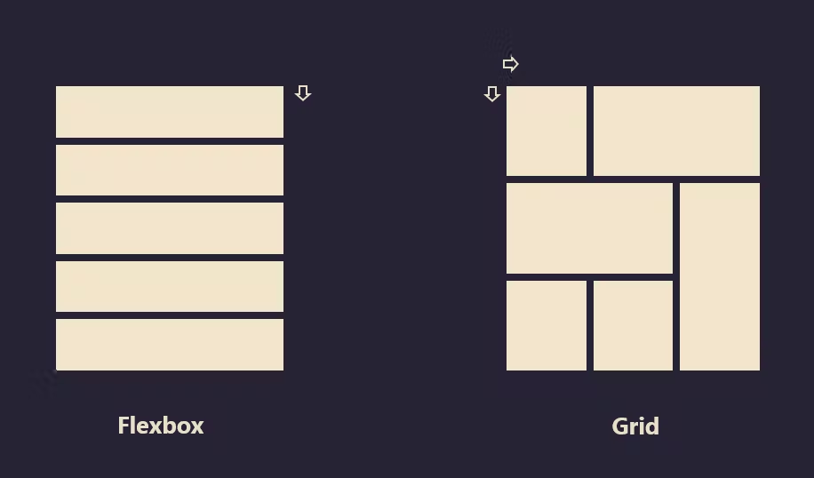
CSS Grid vs Flexbox
CSS Grid and Flexbox are layout models that share similarities and can even be used together. The main difference is that you can use CSS Grid to create two-dimensional layouts. In contrast, you can only use Flexbox to create one-dimensional layouts.
Grid Terminology
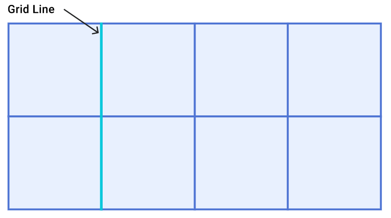
Grid Lines
Grid Tracks
Grid Cell
Grid Area
Gap
Grid Lines
A grid is made up of lines, which run horizontally and vertically. If your grid has four columns, it will have five column lines including the one after the last column.
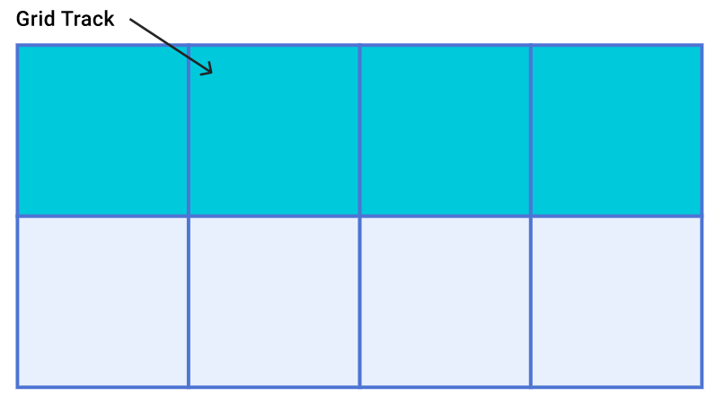
Grid Tracks
A track is the space between two grid lines. A row track is between two row lines and a column track between two column lines. When we create our grid we create these tracks by assigning a size to them.
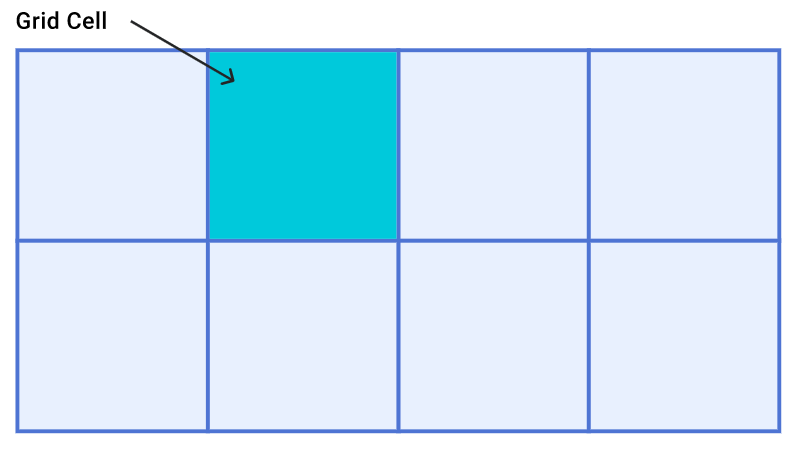
Grid cell
A grid cell is the smallest space on a grid defined by the intersection of row and column tracks. It's just like a table cell or a cell in a spreadsheet. If you define a grid and don't place any of the items they will automatically be laid out one item into each defined grid cell.
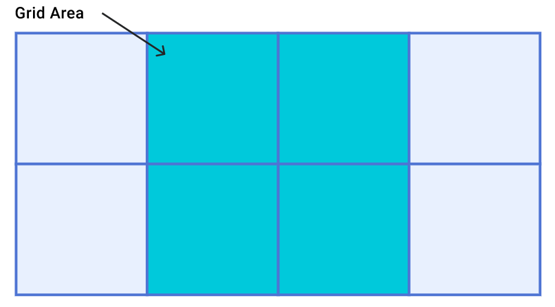
Grid Area
Several grid cells together. Grid areas are created by causing an item to span over multiple tracks. It is the combination of multiple rows and columns.
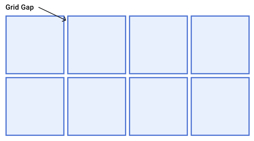
Grid gap
The grid-gap property defines the size of the gap between the rows and columns in a grid layout, and is a shorthand property for the following properties: row-gap column-gap.
Grid Properties
Grid Template Rows
Grid Template Columns
Grid Template Areas
Grid Gap
Grid Template Rows
The grid-template-rows property in CSS is used to set the number of rows and height of the rows in a grid. The values of grid-template-rows are space-separated, where each value represents the height of the row.
Syntax
grid-template-rows: none|auto|max-content|min-content|length;
Example
Grid Template Columns
The grid-template-columns property in CSS is used to set the number of columns and height of the columns in a grid. The values of grid-template-columns are space-separated, where each value represents the height of the columns.
Syntax
grid-template-columns: none|auto|max-content|min-content|length;
Example
Grid Template Areas
The grid-template-areas property in CSS is used to specify the area within the grid layout. The named grid area can be rendered on the screen based on the sequence of values of the grid-template-areas property.
Syntax
grid-template-areas: none|itemnames;
Example
Grid gap
The grid-gap property sets the size of the gap between the rows and columns in a grid layout.
It has two properties:
grid-column-gap property
grid-row-gap property
Syntax
grid-gap: grid-row-gap grid-column-gap;
Grid-column-gap property
It sets the size of the gap between the columns in a grid layout.
Grid-row-gap property
It sets the size of the gap between the rows in a grid layout.
Example


