

WHAT IS MEDIA QUERY??
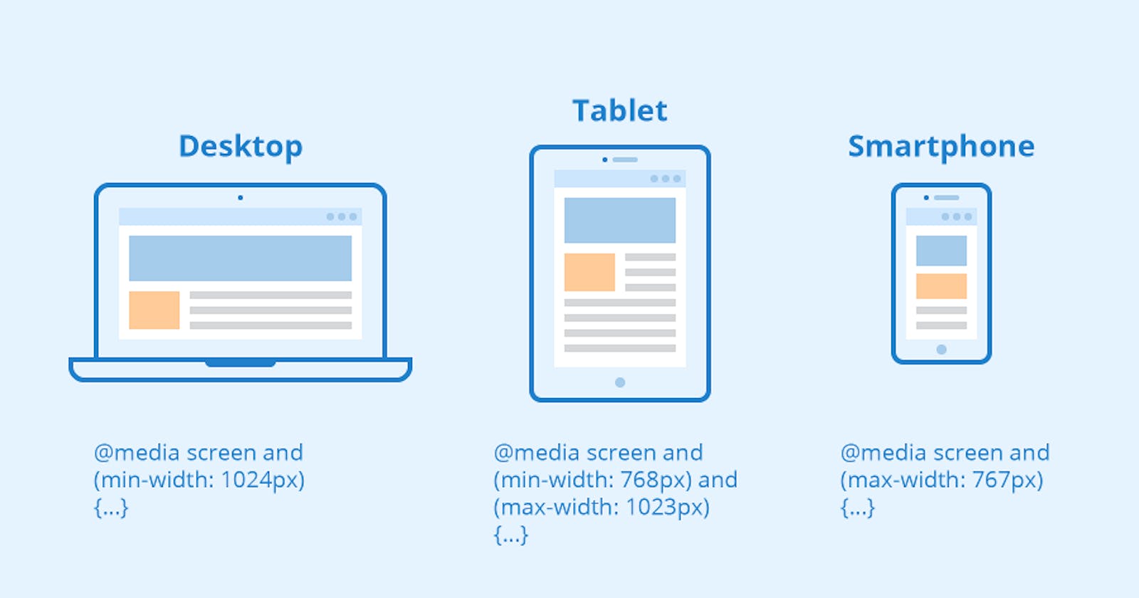
Media Query is used to provide different styles for different devices by using their features like height ,width ,orientation etc. We can create web pages on desktop, tablets, mobile phones, and these pages are responsive websites. This media query makes the website responsive by adding different styles to it.
SYNTAX
@media  mediatype and (expressions) {
  CSS-Code;
}
MEDIA TYPES IN CSS
There are four types of media types which are listed below:
all : This all media type works for all devices.(laptops, mobiles, etc.)
print : This print media type works for devices where the media is in print preview mode.
screen : This screen media type works for devices with screens.
speech : This speech media type works for devices like screen readers where the content is read out loud to the user.
If you want to create more complex media queries, then you can use logical operators.
and - This operator is used to join multiple media features. If all of the media features are true then the styles inside the curly braces will be applied to the page.
not - This operator reverses a true query into a false and a false query into a true.
, (comma) - This operator will separate multiple media features by commas and apply the styles.
BREAKPOINTS
Breakpoints are the most common term you will hear and use. A breakpoint is a key to determine when to change the layout and adapt the new rules inside the media queries.
COMMON BREAKPOINTS FOR SCREENS
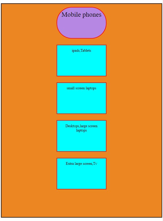
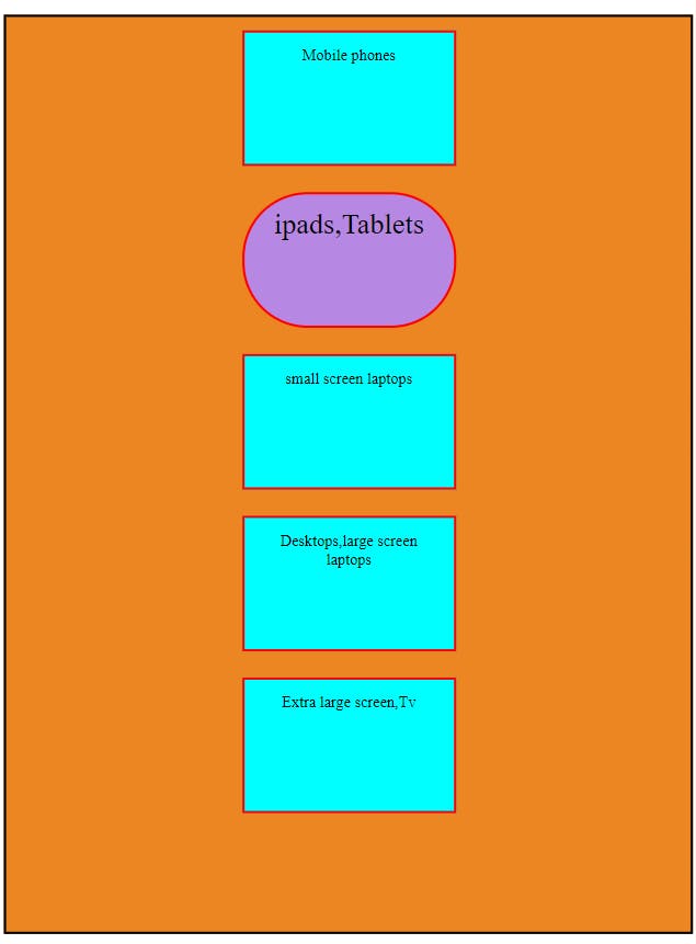
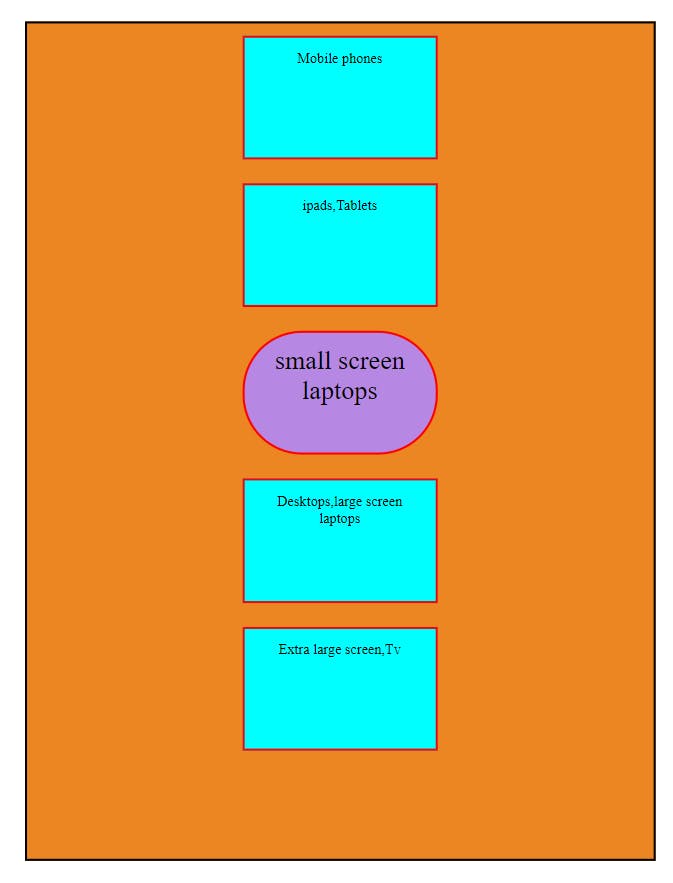
Now let’s see some common breakpoints for widths of devices:
320px — 480px: Mobile devices
481px — 768px: iPads, Tablets
769px — 1024px: Small screens, laptops
1025px — 1200px: Desktops, large screens
1201px and more — Extra large screens, TV
MEDIA QUERY EXAMPLE
MOBILE SCREEN
 @media screen and (min-width:320px) and (max-width:480px){
            .box1{
                background-color: rgb(183, 136, 227);
                font-size: 22px;
                border-radius: 50px;
            }
        }
OUTPUT
TABLET,IPAD SCREEN
 @media screen and (min-width:481px) and (max-width:768px){
            .box2{
                background-color: rgb(183, 136, 227) ;
                font-size: 22px;
                border-radius: 50px;
            }
        }
OUTPUT
LAPTOP, SMALL SCREENS
  @media screen and (min-width:769px) and (max-width:1024px){
            .box3{
                background-color: rgb(183, 136, 227) ;
                font-size: 22px;
                border-radius: 50px;
            }
        }
OUTPUT
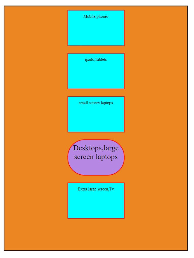
DESKTOP, LARGE SCREENS
@media screen and (min-width:1025px) and (max-width:1200px){
            .box4{
                background-color: rgb(183, 136, 227) ;
                font-size: 22px;
                border-radius: 50px;
            }
        }
OUTPUT
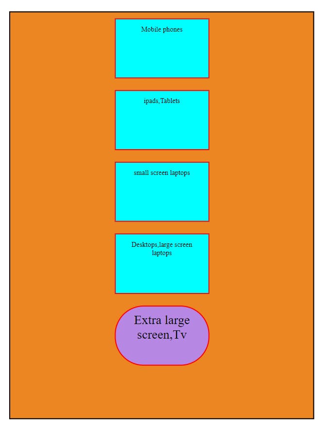
TV, EXTRA LARGE SCREENS
 @media screen and (min-width:1201px) and (max-width:1300px){
            .box5{
                background-color: rgb(183, 136, 227) ;
                font-size: 22px;
                border-radius: 50px;
            }
        }
OUTPUT
ORIENTATION
The orientation in CSS media feature can be used to test the orientation of the viewport. There are two orientation values.
portrait: The viewport is in a portrait orientation, i.e., the height is greater than or equal to the width.
landscape: The viewport is in a landscape orientation, i.e., the width is greater than the height.
SYNTAX
@media (orientation: landscape) {
    /* landscape styles */
}
@media (orientation: portrait) {
    /* portrait styles */
}
ORIENTATION EXAMPLE
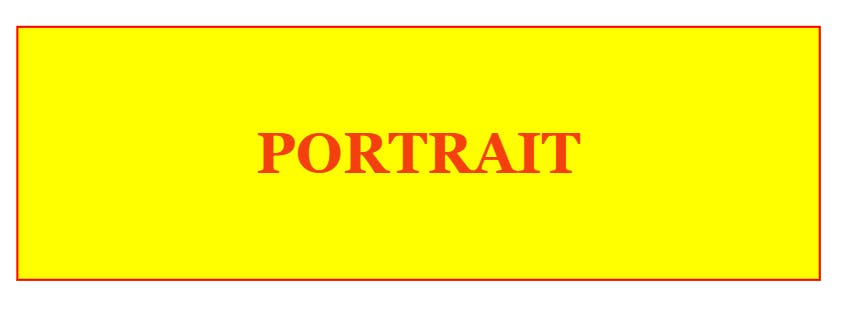
PORTRAIT
 @media  screen and (orientation:portrait) {
            h3{
                color: rgb(244, 64, 14);
                font-size: 3rem;
                font-family: Georgia, 'Times New Roman', Times, serif;
            }

        }
OUTPUT
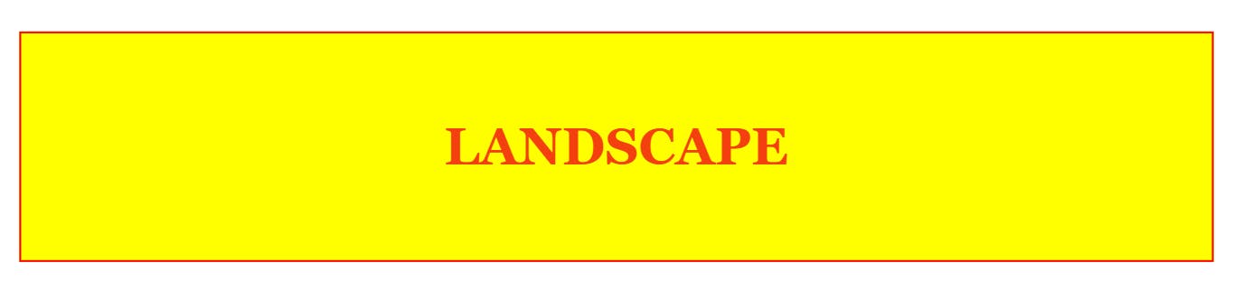
LANDSCAPE
@media  screen and (orientation:landscape) {
            h3{
                color: rgb(244, 64, 14);
                font-size: 3rem;
                font-family: Georgia, 'Times New Roman', Times, serif;
            }

        }
OUTPUT
CONCLUSION
In CSS, a media query is used to apply a set of styles based on the browser's characteristics including width, height, or screen resolution. Responsive Design is the practice of making sure your content looks good on all screen sizes. Everything in the website including layouts, fonts and images should automatically adapt to the user's device by this media query.